Sunday, December 16, 2012

Images of Integration

Slice and dice: that's how I think about the calculus topic of Integration - take something complicated, slice into increasingly fine slices, then put it all back together. In my quest to encourage my students to see this theme in the wonderful world around them, here is a selection of images I used this term to help show the idea, generously made available by people around the world through a Creative Commons License on Flickr. If you're taking great photographs - think about sharing them under Creative Commons - a wonderful resource for teachers to help inspire students.

Graceful flowing curves on the Bay St. Louis bridge
Bay St, St Louis Bridge by Alaskan Dude on Flickr
La Ágora
La Agora, be el.manu on Flickr
L'Hemisfèric
L'Hemisferic by el.manu on Flickr
Tower
Tower by timtom, on Flickr
Untitled
Untitled, by SymoO, on Flickr

The idea of looking for visual representations inspired one of my students to take a photo of the magnificent Neuroscience Research Australia under construction across the road from our school - which just screams at me "Area under the curve!" every time I walk past it.

Neuroscience Research Australia building 2012 - under construction.
Photo by J Yu - used with permission.

This is part 3 of a series of posts on teaching Integration.
Part 2:  Exploring Inequality - an entry point to calculus

Saturday, December 15, 2012

Exploring inequality : an entry point to calculus

"Have you ever noticed .... ", I said to my senior maths class, as I walked in bearing a huge and very obvious glass bowl containing about 40 packets of Smarties, ".. how some people seem to have so much more than other people?"

Taking it Back, Occupy Oakland (19 of 20)
"Taking it Back - Occupy Oakland" by Glenn Halog
http://www.flickr.com/photos/ghalog/6271929376/in/photostream/ CC-BY-NC-2.0

I then proceeded to "share" out the Smarties: first I gave 20 of the 40 packets to one student - making a huge pile on her desk. Her eyes popped out - while the other students looked with disbelief and some concern for their own anticipated share. I gave a wicked grin and 10 packets to the student next to her. To the rest of the class I handed out 2 or 1 packets - apart from a few students at the end of line who received nothing. Oh the looks they gave me!

And so we started a lesson exploring the question of how we could measure income distribution - a hook (although the class didn't know it yet) - to introduce our next calculus topic: integration.  Here are some notes on my first attempts at a lesson design using an idea from economics as a motivation why we might want to find the area between two curves.  But first a big thank-you to mathematics teacher Alastair Lupton who showed me how to bring the Gini Coefficient into the classroom and encouraged me to try it out in my classroom.

So here's the sequence I tried this year.

Step 1: Build interest in the problem. With strict instructions not to eat or worse yet - share - their Smarties, we looked at a short OECD video about the rising inequality in income distribution:


Depending on the time available, you might want to explore some other video material, perhaps some recent news footage of the Occupy movement protests, or look at some studies of global income distribution.

Step 2:  Thinking how to organise the data: I lined up the students, holding their very unequal distribution of Smarties. We ordered the line by 'income' and partitioned into 5 groups - helping the students see the organisation of the data into quintiles.  We returned to our desks and looked at some local and international data on income distribution, also organised into quintiles. Here is some recent Australian data:

Click on the image for a larger view.
Source: Australia Bureau of Statistics 6503.0Household Expenditure Survey and
Survey of Income and Housing User Guide 2009-10

Step 3: Ask the question: "How could we measure inequality?" This isn't easy or obvious. Give the class some time to explore ideas. Then it's time to look at how economists do it...

Step 4: Develop the idea of  graphing cummulative quintiles.  After trying some different ways to plot our quintiles, I showed the students how the economists do it: reorganising the data into cummulative quintiles. This allows us to make normalised curves which work for all situations, regardless of the size of the total income pool. We drew our first Lorenz Curves:

The Lorenz Curve is used to calculate the Gini Coefficient. The area A is the difference from total equality.
The larger the area A as a proportion of the total area A+B, the greater the inequality.
Source: Wikipedia Lorenz Curve Image by Reidpath,

To help explore the idea, we discussed what the Lorenz Curve would look like if one person had all the Smarties, and if all the Smarties were shared equally.  We also considered if the curve would ever go above the "Line of Equality" (it won't!).  We selected different data sets (see references below) and plotted them.  Here is the 1993 World Bank data for Nigeria plotted in GeoGebra, with a polynomial fitted to the curve:

By modelling the curve with a polynomial, we can use integration
to calculate the area under the curve and hence the area between the curves.
Data is entered into the GeoGebra Spreadsheet window, then plotted and
a function calculated to fit the data using FitPoly[].
Step 5: Ask the question again: how could we measure the inequality?  After looking at a few different data sets, students will quickly come to the conclusion that measuring the area between the line of equality and the Lorenz Curve will give us a nice single number. And now you have them hooked: here's a very interesting and practical reason we might want to be able to calculate the area between two curves.

Step 6: Declare a communist revolution.  I then ordered a redistribution of the Smarties so everyone was equal.  This was actually quite funny because several of my diet conscious students insisted they did not want any Smarties. Tongue-in-cheek I told them this was not an option - it was a revolution and everyone had to be equal whether they wanted it or not!  A nice opportunity to open up the discussion to different views about income distribution.  I gave my students a selection of recent articles from The Economist which seemed to provide a good balanced discussion on the topic.

Step 7: Begin the mathematical discussion on ways to calculate the area between the two curves. Your students will have many useful ideas! Try them out with the tools available. And now you're ready to start a calculus based exploration: What is the area under a curve? 

Where could you go with this lesson idea?
  • Get students to make up a small poster using their data and stick them up on the wall. Then as you move through the Integration topic, you can refer to them in the context of each new idea.
  • Once students know how to integrate, get them to model their curves as a polynomial - I like to use the GeoGebra FitPoly[]function - and then do calculate the integral, comparing their result to given Gini Coefficient for the data set.
  • The student data makes for a great application of the Trapezoidal Rule : they can calculate the area without knowing the equation of the curve.  A good example of why you might want to use the numerical approaches to calculating integrals.
  • Challenge activity: calculate the area under the curve using Simpson's Rule. If you only have the standard Simpson's Rule, you can't do it because there are an even number of data points! But there is more than one Simpson's Rule - challenge your students use the internet to find one that will work for this data. [Hint: Simpson's 3/8 rule will work].
  • Apply the concept of the Lorenz Curve to another field of study. An interesting application is to social networks - some people contribute significantly more than others, while others 'lurk' in silence. I use edmodo with my class and there is a high degree of inequality in the number of postings per student - counting postings per students could make for an interesting Lorenz Curve.
Thinking beyond the mathematics:
  • Talk to the economics teachers at your school. I discovered mine do teach the Gini Coefficient, but they don't go into how it is calculated.  I think it could be a very powerful lesson to develop a  sequence of combined economics/calculus lessons with an economics teacher at your school. The more I explored the subject, the more interesting I found it. Options to consider include: the effects of taxation policy on the Lorenz Curve; the differences in the Gini Coefficient between different types of economies; differences within one country over a time series; challenges to the validity of the measure; economic and social arguments on the topic of income distribution.  All highly suitable for deeper mathematical and social science exploration.
  • Take some time out to look at the Gap Minder website which options to view the data through the Gini Coefficient.
Resources
Some teaching reflections:
  • The students really loved the lesson - they were engaged and it was interesting.
  • I planned carefully for my 'inequitable Smarties distribution'. Our class was well established and we knew each other well enough that my students would know I was up to something and trust me when I played this game. I also made sure the students who didn't receive Smarties were the most resilient, confident students.
  • I did however make the mistake of trying to do this opening lesson in a single 50 minute period - it wasn't enough time and I rushed it, making it less student centred than I had hoped. This lesson needs a double period to do it justice. 
  • Is it worth taking the time out from a busy course to do this activity? I think so. Once I realised I could leverage this work into my teaching of the Trapezoidal Rule, Simpson's Rule, the area between two curves and also do some polynomial modelling, I saw it was a lesson that  just "keeps on giving".
  • Coming from a physics background, it was wonderful to find an interesting and practical application of calculus to a completely different field. Many of my students are planning a career in business and are interesting in economics - here was something to show them the calculus applied to money as much as to speeding particles!
This is part 2 of a sequence of posts on teaching integration. 
Part 1: Slicing and Dicing.  Part 3: Integration in the world around us

Sunday, December 9, 2012

Slicing and Dicing

To my way of thinking, the topic of Integration is all about 'slicing and dicing' - thinking about what happens when you take an object and chop it into increasingly thinner slices, then put those slices all back together again. Here's a fascinating and gruesome hook I used in my senior mathematics class this year to consolidate* the theme of "slicing and dicing": What would happen if you sliced up a human being?

Warning: This content is only suitable for a senior class, and you should warn students there are medical images coming up. There won't be any blood, but it might affect sensitive students and the dissection of human bodies may not be culturally appropriate in your classroom.

First we start in reverse, using a scene from one of my favourite science fiction films "The Fifth Element"


Then let your students know the images of the human body used aren't computer generated, but actually come from The Visible Human Project. Cue in this video clip:


My students were grossed out and fascinated - and then asked to see it several more times! It took them a while to come to terms with the fact the images weren't generated using a medical scanning device, but by actually slicing up a body. Lots of questions followed!

Depending on time and if you think this is a good idea or not, there are some websites where students can use an online Java application to dynamically explore the data by selecting their own slices in any orientation and see the resulting image created by reassembling the original slices to your specification. 

Here are two websites I found worth exploring:


Where to next? Many options for discussion about: 
  • the mathematics and computation required to reassemble the data so that different views can be constructed.
  • the ethics of using bodies from condemned prisoners for science.
  • the value of the data from The Visible Human Project - there were scientific as well as ethical criticisms of the project.
  • Recent advances in 3D printing technology to "print" biological components using layers of living cells. A long term goal is to print transplant organs using cells from the donor. A quality video from ABC Catalyst program at http://www.abc.net.au/catalyst/stories/3618385.htm (starting at 00:03:00).

One of my students later told me the data from The Visible Human Project is also used in a (rather violent) Japanese manga film Gantz.

(*) I used this lesson idea in the middle of the topic sequence. For my first Integration lesson, I went down a different path - but that's for the next post!  Part 2: Exploring Inequality

Sunday, December 2, 2012

Still going ...


yellow
Photo: "Yellow" by darkmatter CC-BY-NC-ND
http://www.flickr.com/photos/cdm/84202849/
It's been a very long and tough final school term. I'm still running the "marathon" - albeit limping on some days. Ran headlong into some very steep hills (teaching Mathematics Extension 2 for the first time, in addition to teaching Mathematics Extension 1 for the first time... madness!). Combine this with the normal teaching load, writing over a hundred school reports and accumulated sleep deprivation - not good. Running too fast, too hard - feels like I've done a year's work in a term.  In recovery mode now - still hundreds of end-of-year papers to mark but only a few weeks to go!

Like all marathons though, the experience is amazing - the views incredible. Lots of teaching ideas share in this blog once my energy levels are restored.

Saturday, October 20, 2012

The blue shark of full mastery

"Sir, does mastery count for more than the test mark?", asked one of my Year 7 students this week. I beamed back - "YES!"  Slowly but surely, I'm weaning this class to look beyond their scores ("You got 95%! I got 98%!" ... yes - it's a high achieving class :-) ) and focusing on mastery.  Recently I have been making little mini-report cards which I staple onto the end-of-topic test paper:


My classes now have a symbolic language for achievement levels : the red dolphin stamp is 'Not Demonstrated' and 'Starting Out', the orange seahorse is for 'Progressing', and the orange killer whale is for "Mastery". If you get Mastery for all the standards, you also get the blue shark.  I find the visual imagery helps focus on achievement of the standards.  And it doesn't just work for Year 7 - even my Year 12 students like the blue shark.

My goal with these mini report cards is to make the standards and the student's achievement of those standards prominent - the topic test score is there, but it doesn't dominate the feedback.  Why? Because even in this high achieving class, a score of 90% means there is something students can improve on - and I want to focus on that specific item. I try to write a helpful comment, focusing on the standards that need work and some ideas how the student can advance that standard. While the students are looking at their test, I walk around the class and try to chat to every student about their achievement in terms of the standards and what we can do to raise them (that can be hard with 28 students in 30 minutes!).

These little report cards though reveal a deeper change in my approach to Standards Based Grading....

SBG: Where I'm at now
Time pressures have taken their toll on my loftier goals of high precision SBG implementation - and I have found I'm migrating closer to what Frank Noschese calls "Keep It Simple Standards Based Grading.  Now that I have simplified the system, I find it also makes it clearer and more approachable to students.

Less standards per topic - especially for junior classes. My lists are still too long for senior classes - mainly because I am trying to cover all the syllabus points (there are a lot!). 

Achievement levels: I'm happy with the language of my achievement levels "Not Demonstrated/Starting Out/Progressing/Mastery" - I believe they give clear and honest feedback without being discouraging - they don't say 'you failed' - they say 'you're not there yet'. I'm not comfortable with a simple Yes/No binary decision because I want the levels to support my goals for student motivation and engagement - to reinforce they are on a learning path - I want to recognise their 'progress so far'. A sheet full of 'No' results isn't going to encourage lower achieving students.

The role of quizzes: I have effectively stopped using quizzes for grades.  Woah - that's a big departure from the SBG ethos! Why? Because I believe that meeting standards once in a quiz isn't enough : the student has to retain the standard. So for me, the end of topic test does matter. If a student could demonstrate the standard in quizzes during the topic, but can't demonstrate them at the end of the topic, I think there is a problem.  But I haven't abandoned quizzes - on the contrary, they are a key part of my formative assessment strategy. I still give regular quizzes and use the dolphins, seahorses, killer-whales and blue sharks to give feedback during the topic. I do record the quiz results to help direct my teaching of the topic. But the difference is quizzes taken during the teaching of a topic don't count toward grades. I save that for the end of the topic. If a during-topic quiz shows me a few students need help on a specific standard, I give them specific support. If I see many students need help on a specific standard, then I alter the teaching the next day and put this standard in the next quiz for the whole class. So I don't do repeat attempts on quizzes, and I don't try to juggle grades based on quizzes and quiz retries.

The role of topic tests: I use the topic test to decide the level of achievement for each standard and report this to students with their topic test mark. I do this by grouping test questions against standards - either explicitly in the test design, or working backwards from a preexisting test. This does mean marking takes longer, but it gives much more useful feedback than a single test score. The results should not be a big surprise because the quizzes have been giving the student feedback along the way.  Retry attempts happen after the topic test, I give students the chance to improve their topic grade by taking quizzes or alternate tests for specific standards. That's how they can change their topic grade. In my grade book I have the topic test result (which stays constant), and an array of standards achievements which can be updated by retries.

Topic test result is recorded, along with initial end-of-topic achievement of standards.
I use red-orange-green traffic light indicators to quickly spot areas of concern.
Students can improve their standards results after the topic test by taking quizzes.
The final grade: I blend the topic test (snapshot in time result), with the standards achievement levels (which students can change through post-test quizzes) - giving more weighting to the standards indicators than to the topic test results. Why? Because I want students to have the opportunity to raise their grade through further effort. This reduces test anxiety and redirects the learning focus to mastery. 

And back to the blue shark .... stamps are fun - kids (and teachers!) love them. And when it comes to assessment, having a discussion about whether you got a seahorse, a killer whale or a blue shark - well it just takes some of the sting out of assessment and helps everyone realise the symbol or the grade isn't what's important : it's working towards mastery that counts.
Woot! A blue shark!
I get my animal stamps from www.allyoucanstamp.com 
A note on my constraints: I am the only teacher in my faculty using SBG - so I have to maintain the topic test results to allow for comparison across classes. With middle level classes, my grading system has to be consistent with other teachers (since we rank across the cohort) so my grades have to come exclusively from the tests. Perhaps one day I might be able to convince my colleagues to allow retries for the grading in these classes. For the senior years there are statutory regulations on assessment policy which are sadly high-stakes, single-attempt only assessments. So for the higher level classes, I can only use SBG to guide my formative assessment.  My hope is that this translates into the summative assessment results.

Your thoughts? Have I oversimplified SBG? How could I improve this approach?

Saturday, October 13, 2012

Polynomial stories

What's not to like to about polynomials? They look amazing - and they are just great fun to play with - especially if you have dynamic graphing software to explore their shapes. Here are a few teaching ideas I developed over the last few weeks.

First and foremost we need a character : meet Polly the Amazonian parrot. There's a reason she is from the Amazon... you'll see soon.

Amazona agilis by Jacques Barraband(1767-1809)
http://commons.wikimedia.org/wiki/File:Amazona_agilis_-_Barraband.jpg

Polly featured throughout my lessons - my favourite was the zero polynomial $P(x) = 0$

Reminds me of a Monty Python sketch ....

and later when we looked at taking the second derivative, then the third, fourth, and fifth derivatives - the disappearing Polly:

The Disappearing Polynomial

I'm a big believer in having 'characters' to help teach mathematics - I think they act as 'mental anchor points' to help link related concepts, and then make high level linkages across topics more visible - as in the example above of the disappearing polynomial.

Then we need to explore the properties of polynomials. If we have a quartic polynomial, how does its graph change if we change the roots? I got a good response to my students with this homework exploration tool - I used it for a 'flipped' lesson:
Lesson 02 FLIPPED Graphs of Polynomials

Early on in the presentation of polynomials, I think it's a good idea to show some of the interesting applications:

Using polynomials for modelling. I used this example of a photograph of the Amazon river, loaded into GeoGebra, fitted to a polynomial using the FitPoly function.  Why would we want to do this? I suggested in this case, having an equation for the Amazon River could help us model water flow - perhaps helped by working out the gradient function:

Amazon River – photo from NASA. 
Curve fitting using GeoGebra FitPoly[] function.   
http://commons.wikimedia.org/wiki/File:Amazon_57.53278W_2.71207S.jpg

Using polynomials to approximate other functions: A good time I think to introduce the Taylor Series:


No need to go into deep explanations - just show what is possible with polynomials. I returned to this idea in the next topic when showing higher derivatives, and have another visit planned when we do complex numbers to help demonstrate the famous Euler Formula.

And finally, after demonstrating the closure of polynomial operations for addition, subtraction and multiplication, students may find it interesting to learn about the role polynomials play in many encryption systems.


I looked hard for an online paper suitable for advanced high school students - the best I have found so far is Christopher Cooper's notes for his "Languages and Machines" course at Macquarie University.


More GeoGebra HowTo Sheets

Thursday, October 4, 2012

Newton and Descartes channel Dan Meyer

There's a definite pause the first time you show parametric equations to  students well conditioned to Cartesian representations.  I like to imagine Descartes himself staring at the equations pondering : "Why would you do that????"

We're not in Kansas any more!
Descartes: "Why would you do that? It's the same end result!"
Here are three teaching ideas I used this year with my senior mathematics class which may supplement the traditional approach of showing the different representations are functionally equivalent.

1. Extend the function machine idea to show a weird new parametric function machine. Now we have two outputs!  Here are the two function machine images I use for my resources:

Based on a function machine diagram at http://raider.mountunion.edu/ma/MA125/Fall2011/Chapter7/IntroToFunctions.html
I removed text from the original image, then adjusted it to make the parametric machine.

2. Explore the reasons why we might want to use parametric expressions to describe a relationship. 

The best I answer I came up was this (click on the image for a larger view):

Newton and Descartes ponder Dan Meyer's "Will it hit the hoop" lesson.
My students did this activity in a previous lesson, so they got the joke.

In other words, a parametric description of this scenario lends itself to a deeper understanding of the physics of the situation. 

Another reason for using parametric equations is that the maths can be much more interesting - and possibly a lot easier to work with.  Parametrics also give us another way to get a feel for the constraints at work in a locus.  I love this wonderful "move the robot" explanation from James Tanton - and it speaks to my IT background where parameter go in, and things move accordingly!


3. Get a feel for parametrics by controlling the parameter using dynamic geometry software.  I found it really helped my students to build a parametric representation, then adjust the parameter by moving sliders and then seeing points move under their control. Actually touching and moving and parameter reinforces the idea of a point travelling along a path under a constraint.  Here is a resources for students to explore parametric representation of the parabola using GeoGebra:


HowTo Guide: Exploring the Parametric Representation of the Parabola

This guide is part of my collection at GeoGebra HowTo 

Saturday, September 22, 2012

Toys and tools for exploring the Parabola

Following on from three ideas to introduce locus, here are three ideas I used to help make the locus of the parabola come alive for my students. Regular readers of this blog will know how much I believe in the benefits of hands on exploration of mathematical objects - and these are very hands on!

The three ideas are:
  • Use a MIRA mirror to construct a parabola. My senior students loved this activity- a chance to revert to back to childhood, while still being challenging.
  • Use GeoGebra to construct a parabola given any arbitrary focus point and directrix. Try this with non-standard orientations.
  • Be entranced by a wonderful 3D optical illusion toy that exploits the properties of the parabola.

1. Using a MIRA mirror (MIRA math tool) to construct a parabola
I'm extremely fortunate to have a box of these in my faculty storeroom:
Source:  http://www.enasco.com/product/TB14953T 
While they look like tools for the junior math room (and they are wonderful to use in this context!), there's no reason our senior students should be locked out from using them! Here is a worksheet that give instructions on constructing a parabola with the MIRA mirror.  It's a really fun activity - a chance for senior students to play a little - and a great opportunity to ask the "why" question - reinforcing the idea of locus and the locus definition of a parabola.

Locus and Parabola MIRA Parabola GHT0501

2. Constructing a parabola using GeoGebra.
Why do I need special help to construct a parabola in GeoGebra you may say? Of course GeoGebra can construct a parabola with zero effort. But this guide explores how to construct a parabola using the locus approach.


Can you find the parabola given any arbitrary focus
point F and directrix AB?

Locus and Parabola Make a Parabola GHT0301

3. Discover something special about the parabola
A terrific toy worthy of being in your mathematics (and science) classroom is the Optigone Mirage®.

The Optigone  Mirage® is a pair of twin parabolic mirrors, arranged to project
a 3D image floating above the top of the kit. In this image from a paper by Christian Ucke,
the pig is actually inside the mirrors.
As always, encourage students to play with the toy (not that they will need encouragement - my students had their smartphones out takings photographs within seconds!), then ask the Why? question. Even though I purchased* one of these for my senior mathematics class, students across all my classes were entranced by it - and it gave me great pleasure to say to the juniors "you will learn how it works in your maths and science classes in a few years".

* Sadly I could not find a convenient way to purchase one of these in Australia - so I ended up buying a  clone from Australian Geographic.

Sunday, September 9, 2012

How do you do that in GeoGebra?

Looking back on my own high school mathematics education, I realise I never really knew what a parallelogram was. I never knew how it 'worked', how its angles and diagonals operated, how they changed when the slope of the parallel lines was changed. The rhombus? All I could really say - if I remembered it at all - was it was a kind of squashed up square. If only I had  been given a dynamic geometry tool to play with! As a teacher now, I strive to have my students actually touch mathematical objects - to move them, push them, pull them, to watch what happens. I'm convinced that if students do that, so long as they are reflecting on what is happening to the objects (and why), they will remember them for life.  And the ideal tool for hands-on interaction: GeoGebra.  Free software, runs on Windows, Apple and Linux (anything that runs Java), backed by a community of hundreds of thousands of teachers using and sharing GeoGebra resources.

A resource I haven't found yet though is a set of simple, one page instructions I can give to students showing how to construct a certain mathematical objects in GeoGebra, so I have begun building some.

Here's the first installment:

For Junior and Middle School
How to construct a rhombus. This one appears simple but can be confusing - practice it first before giving to students.
For Senior School

I have put these links on a new GeoGebra HowTo page in this blog. These files are also available at the Maths Faculty sharing repository.

Saturday, September 1, 2012

Three teaching ideas for introducing locus

Here's three ideas I use for introducing locus.

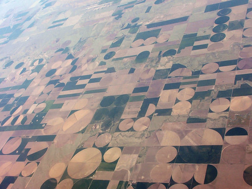
1. What makes these shapes? Have you ever looked down from an airplane window and seen a sight like this? Something you will often see above large scale farming areas:

Mid-West Agriculture
Centre Pivot Irrigation - an example of locus of the circle.
Photo: Etienne Boucher CC-BY-BY-NC-SA 
Give the students some time to digest these images - you will hear lots of wild theories.

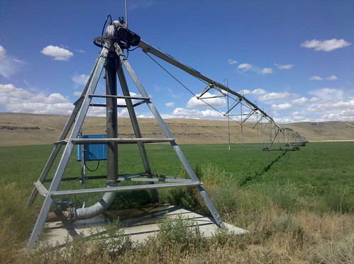
Then show this picture and see if they can work it out:

Center-pivot irrigation
“Centre Pivot Irrigation” Matt Green CC-BY-NC-SA
The Wikipedia page on Centre Pivot Irrigation has lots more interesting information.

2. Acting the Goat.  Tie yourself with a rope to a chair or desk and pretend to be a goat. Explain how goats will eat absolutely everything in sight. Model the behaviour. A good laugh - and your class won't forget the locus of a circle or the concept of a constraint determining the locus. Then extend the idea to different situations of a goat on a leash (tied to a fence with a sliding leash, etc).
Built the idea of a locus by "acting the goat".

3. Who cares about locus?  Show an image like this:

Astronaut Stephen K. Robinson, STS-114 mission specialist, 
anchored to a foot restraint on the International Space Station’s Canadarm2.
Photo: NASA
 http://spaceflight.nasa.gov/gallery/images/shuttle/sts-114/html/s114e6647.html

This person certainly cares about locus! Also a good opportunity to raise awareness of the International Space Station. More information on the Canadarm2 at http://science.nasa.gov/science-news/science-at-nasa/2001/ast18apr_1/

I said three ideas? Sorry - I can't resist sharing three more ...

4. "Locus Pocus" : A high quality video about locus well worth showing in class is Erica Morabito's Locus Pocus.


I like this video because it creates some memorable visual representations of specific locus problems that students need to know while also being entertaining and succinct (lesson time is a precious resource!).

5. Introduce the ellipse : Most students have an idea what an ellipse is, but very few know how to make them or the locus idea behind them. This YouTube clip give a good demonstration:


and I wrap up this discussion with a picture of my favourite example of an ellipse in action:

Locus of the ellipse at work in the universe:
a stunning NASA image of Io orbiting Jupiter.
http://www.nasa.gov/mission_pages/juno/multimedia/pia02879.html
Yes - another segue into astronomy.  Locus is manifest throughout our universe - it would be remiss of us not to show such stunning images of it at work.

6. Work the Geometry 'vs' Algebra dynamic: I find it helps students to be explicit about the two different approaches to curves (geometric versus algebraic). It seems to me many students prefer the algebraic - so we need to work extra hard to show the virtue and value of the locus view. I reintroduce our fellow travelers Euclid and Descartes and show the dynamic at work - that we want to be able to switch between them with ease.

Every time I have an idea or problem to develop with the class, I invoke the Euclid/Descartes duo. It's fun to have great mathematicians in the classroom with you - and it helps develop a broader of mathematics as a dynamic, developing intellectual inquiry - something students can participate in and perhaps even extend.

Next post in this sequence: Teaching ideas for introducing the locus of the parabola.

Saturday, August 25, 2012

Moves in translation with Miss Anna Parabola

Some concepts are so powerful in mathematics, they just keep popping in your course again and again - like old friends. Such an idea is the translation of a curve in the number plane. In my class, this old friend has a name: Miss Anna Parabola. Anna has been making an appearance throughout my course, starting off with an introduction to the quadratic function.

Miss Anna Parabola demonstrates $y = x^2, y = -x^2, y = x^2 + k$.
Ballerina: Alicia Alonso in 1944, photographed by Gjon Mili for Life magazine

I will admit to raising and lowering my arms in the different ballet positions in class, standing up on chairs (against OH&S regulations ....) - but I vehemently deny donning a tutu. 

I knew I was onto a good thing when I started teaching the topic "Locus and the Parabola". One of our textbooks spends an arduous 35 pages (no kidding) going through all the iterations of the different orientations and translations of the parabola - but I realised with our class understanding of Miss Anna's dance moves, we could collapse the entire thing into two lessons: one lesson to cover the different orientations, one to cover the translation.

The Four Standard Orientations of the Parabola -
as interpreted by Miss Anna Parabola (aka Alicia Alonso)
(Click image for a larger view)

Translating the vertex.

And it worked : my students can now do this effectively and efficiently. They connected our previous work on shifting curves like $x^2 + y^2 = 25$ to $(x-2)^2 + (y+4)^2 = 25$ to this work on shifting the parabolas. We cracked what would otherwise be a very arduous (and boring) part of the topic by focusing on the key idea of 'moves in translation'.   I'm a big fan of creating characters and story to build a narrative in the course, so I was thrilled to see the work from previous topics developing Anna Parabola pay off like this.

Oh - and in case you haven't heard of him, Anna has a new friend: Billy the goat. Billy helps develop the idea of locus : if you tied him to a fence, he would happily devour everything around him, following the locus constraint imposed on him.  And yes - I do admit to tying myself to a desk and 'acting the goat'.  How am I going to live this down....?

PS: I'm not sure this trick would work at a boys' school.... Might have to invent a rugby player in motion...

Sunday, July 22, 2012

Art photography in the maths classroom - thanks to flickr

So much of the mathematics content we teach appears to many students to be fairly dry on the surface - we hope we bring them on the journey to see its wonder, but there is nothing like a great visual to create interest and start a quality discussion. Recently I tapped into an amazing resource: flickr photos provided under Creative Commons licenses.  There are thousands of high quality inspirational photographs available just waiting to go into a mathematics lesson.

For the topic "The Quadratic Function", water was my visual theme. I use just one of these images for each lesson - we start the lesson with a full screen, high definition version and then I use smaller versions to create a visual link for transitions between lesson activities.

Water is Life water and light parabloa?
frozen moment chasing water I Fuente // Fountain
All images under Creative Commons. Click on the photograph for details.

For the topic "Locus and the Parabola" I blended an astronomy theme (think: parabolic reflectors) and more abstract designs:

Outreach North of Umatilla A fly's eye view Is a Flickr image good if its thumbnail isn't? Curly Wurly rope handsome antenna Tangents Marinos Ices Mixture
All images under Creative Commons. Click on the photograph for details.

These images look spectacular in high definition projected onto a screen in class - and give an opportunity to engage in some broader discussion about the application of mathematics, and the relationships between art, science and mathematics. Interesting to see students also noticing the use of Creative Commons - a chance to model good practice and spread the CC message.

Because the creators of these images generously put their work 'into the commons',  I can use them in my own works and then in turn, share those works with other teachers without any copyright constraints - hopefully helping students in many other classes.

Finding Creative Commons licensed content on flickr
Use the Advanced Search feature:


scroll down and select these boxes:


I also select "Interesting" which tends to return richer images. When using the image, make a CC attribution and provide a link back to flickr page. I also like to leave a thank you comment to author. And thank you flickr for coming to the CC party. Now if only Google would make CC searching available on its main image search page! I believe it is there - just hidden - and life is too short to look for hidden options.